MANCHESTER AIRPORT GROUP

Transfer Product

Redefining Performance, Scalability,
and User Experience.


MANCHESTER AIRPORT GROUP

Transfer Product

Redefining Performance, Scalability,
and User Experience.


MANCHESTER AIRPORT GROUP

Transfer Product

Redefining Performance, Scalability,
and User Experience.

MANCHESTER AIRPORT GROUP

MANCHESTER AIRPORT GROUP

Transfer Product

Transfer Product

Redefining the airport travel experience with a groundbreaking product.

Redefining the airport travel experience with a

groundbreaking product.

Redefining the airport travel experience with a groundbreaking product.

MANCHESTER AIRPORT GROUP

Transfer Product

Redefining the airport travel experience with a groundbreaking product.

MANCHESTER AIRPORT GROUP

Transfer Product

Redefining the airport travel experience with
a groundbreaking product.

MANCHESTER AIRPORT GROUP

Transfer Product

Redefining the airport travel experience with
a groundbreaking product.

The brief

The brief

Creating a seamless end-to-end travel experience by evolving the user journey provided by Looking4Transfers, a transfer business recently acquired by MAG-O, and tailoring it to align with Manchester Airport Group’s vision of owning the entire travel journey.

My role

As the Lead Designer on this project, I played a pivotal role within a cross-functional team. I was responsible for all aspects of the design process, from crafting user journeys to creating interfaces that aligned with the project’s vision. I conducted usability tests to validate and refine our concepts and facilitated workshops to collaboratively define the MVP of the product. My efforts ensured that the design was user-centred, practical, and aligned with the business goals.

As the Lead Designer on this project, I played a pivotal role within a cross-functional team.
I was responsible for all aspects of the design process, from crafting user journeys to creating interfaces that aligned with the project’s vision. I conducted usability tests to validate and refine our concepts and facilitated workshops to collaboratively define the MVP of the product. My efforts ensured that the design was user-centred, practical, and aligned with the business goals.

The approach

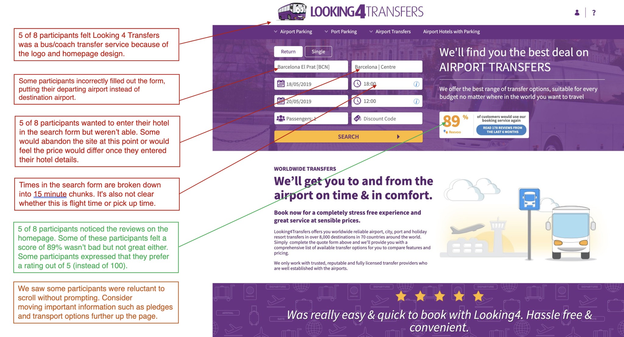
Our approach started with testing the Looking4Transfer product to uncover usability issues that needed to be addressed. From there, we rapidly prototyped a concept and tested it with users while conducting interviews to gain deeper insights into their needs for travelling to and from the airport. These findings guided the definition of the MVP, which we successfully launched. To ensure ongoing optimisation, we created an A/B testing backlog to continuously improve the product.

Extract of usability testing on MAG-O’s acquired Looking4Transfer product

Extract of usability testing on MAG-O’s
acquired Looking4Transfer product

Extract of usability testing on MAG-O’s
acquired Looking4Transfer product

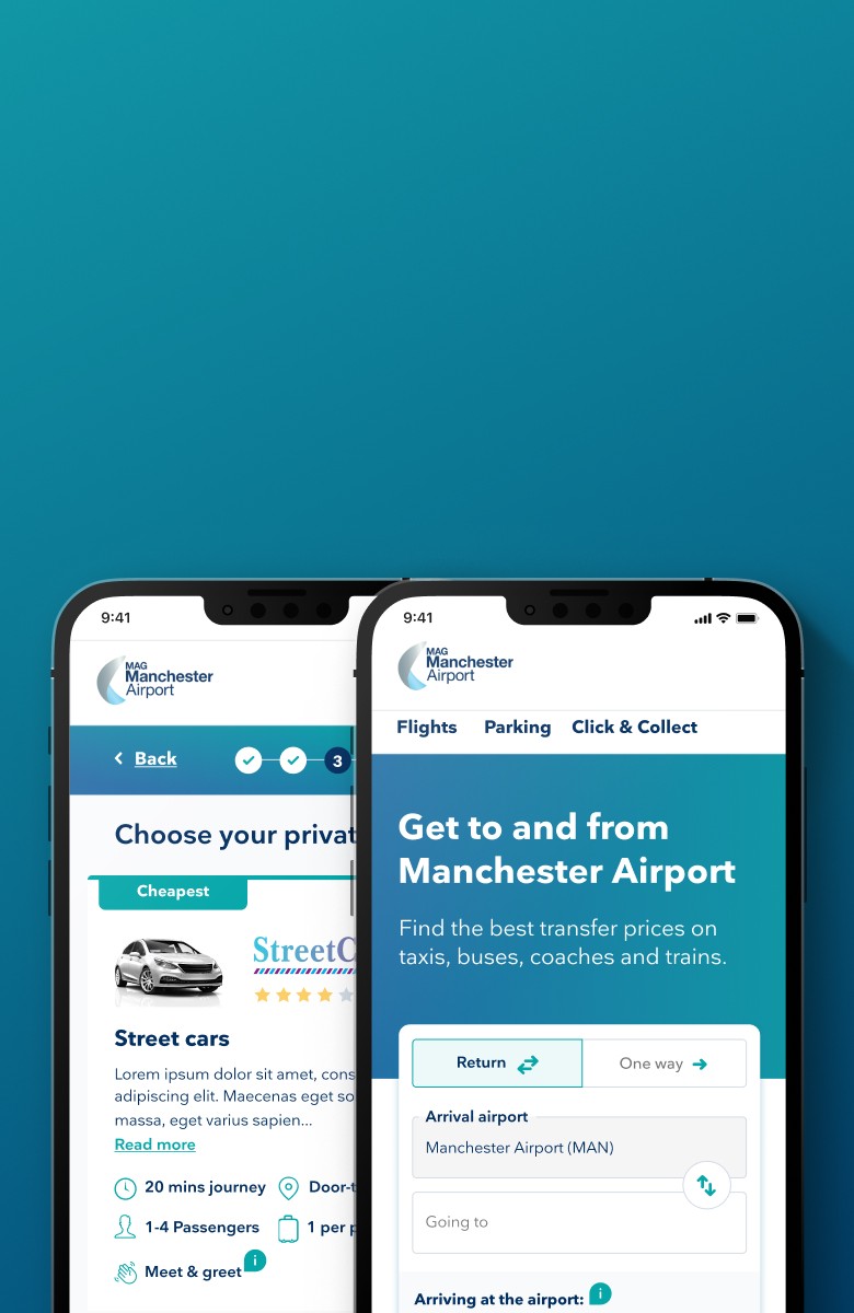
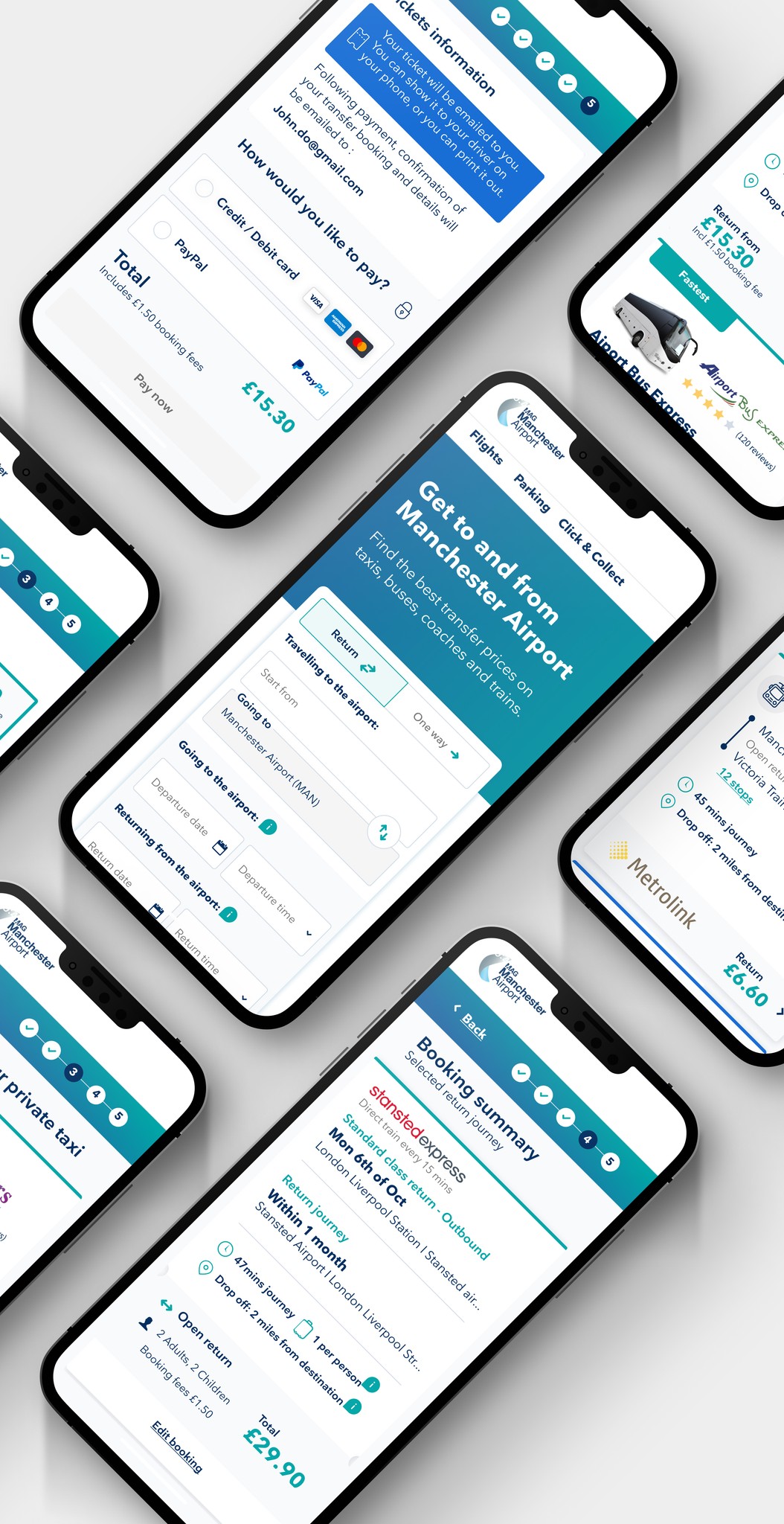
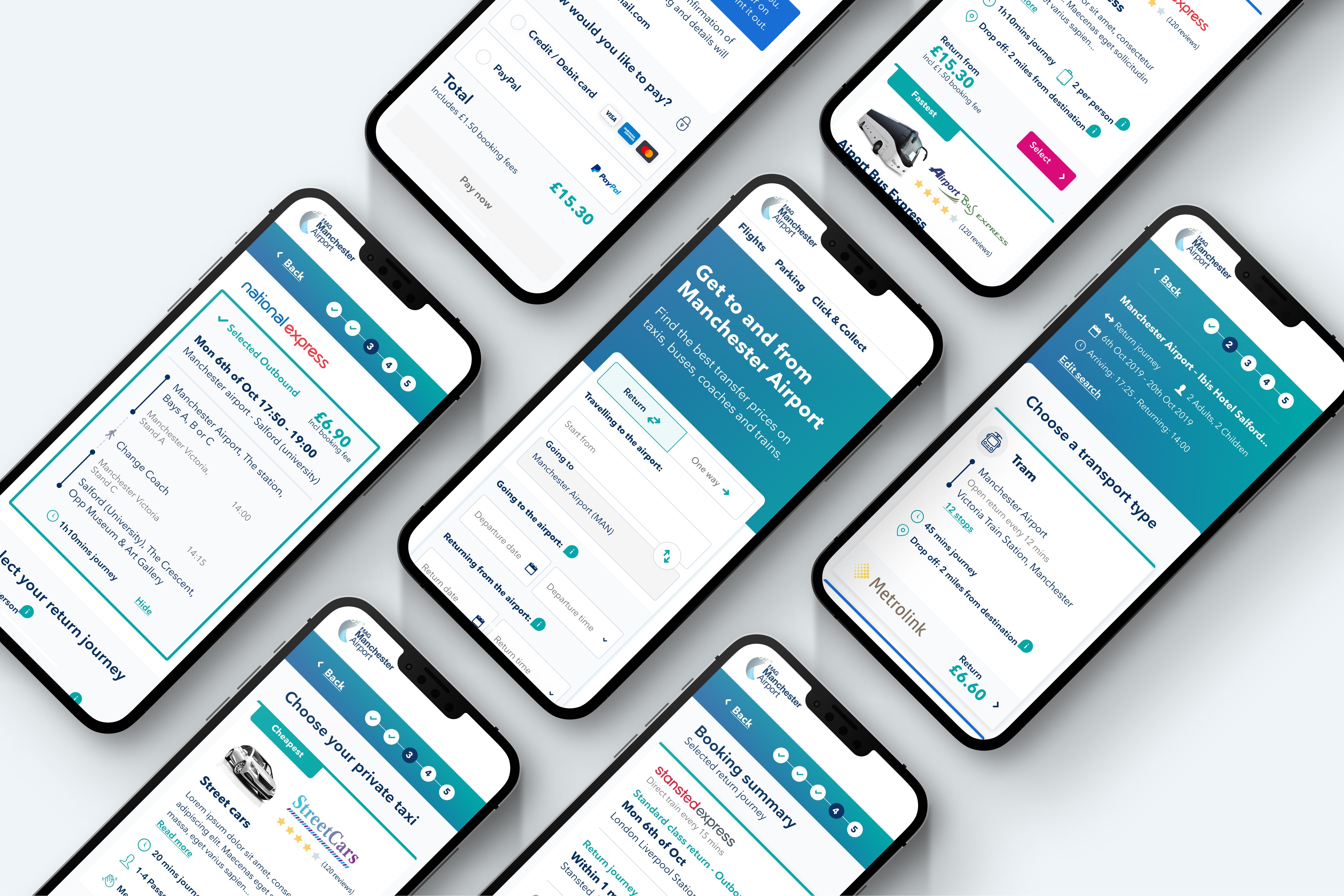
Testing the MVP and Refining the Search Journey

After conducting initial usability testing on the acquired Looking4Transfer product, we defined the MVP with a focus on launching taxis, buses, and the Stansted Express train. For this case study, we will concentrate on the search journey, as it presents the most significant user challenges.


Feedback from usability testing revealed key issues with the landing page and search functionality:

  • Confusion around the date and time picker on both mobile and desktop, with participants often overlooking the time field.

  • Difficulties interacting with the calendar on mobile, as users

    expected it to close when tapping away or anticipated a button

    like “OK” or “Go.”

  • Misunderstandings about “transfer from” and “transfer to,” with

    comments like “What if I want both?” stemming from the absence of

    a visible return tick box.


These insights guided critical refinements to improve the user experience, ensuring the search journey became more intuitive and user-friendly.

After conducting initial usability testing on the acquired Looking4Transfer product, we defined the MVP with a focus on launching taxis, buses, and the Stansted Express train. For this case study, we will concentrate on the search journey, as it presents the most significant user challenges.


Feedback from usability testing revealed key issues with the landing page and search functionality:

  • Confusion around the date and time picker on both mobile and desktop, with participants often overlooking the time field.

  • Difficulties interacting with the calendar on mobile, as users expected it to close when tapping away or anticipated a button like “OK” or “Go.”

  • Misunderstandings about “transfer from” and “transfer to,” with comments like “What if I want both?” stemming from the absence of a visible return tick box.


These insights guided critical refinements to improve the user experience, ensuring the search journey became more intuitive and user-friendly.

After conducting initial usability testing on the acquired Looking4Transfer product, we defined the MVP with a focus on launching taxis, buses, and the Stansted Express train. For this case study, we will concentrate on the search journey, as it presents the most significant user challenges.


Feedback from usability testing revealed key issues with the landing page and search functionality:

  • Confusion around the date and time picker on both mobile and desktop, with participants often

    overlooking the time field.

  • Difficulties interacting with the calendar on mobile, as users expected it to close when tapping

    away or anticipated a button like “OK” or “Go.”

  • Misunderstandings about “transfer from” and “transfer to,” with comments like “What if I want

    both?” stemming from the absence of a visible return tick box.


These insights guided critical refinements to improve the user experience, ensuring the search journey became more intuitive and user-friendly.

Refining the Search Experience

Based on insights from the usability testing, we iterated on the prototype by making new assumptions and implementing key design changes to improve the search journey.


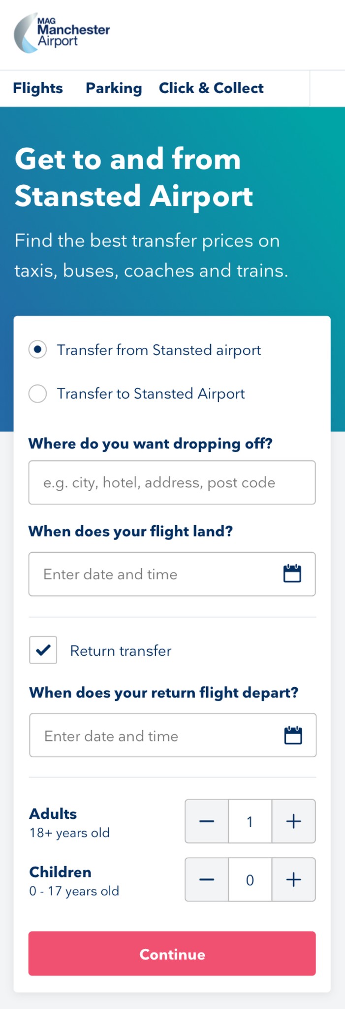
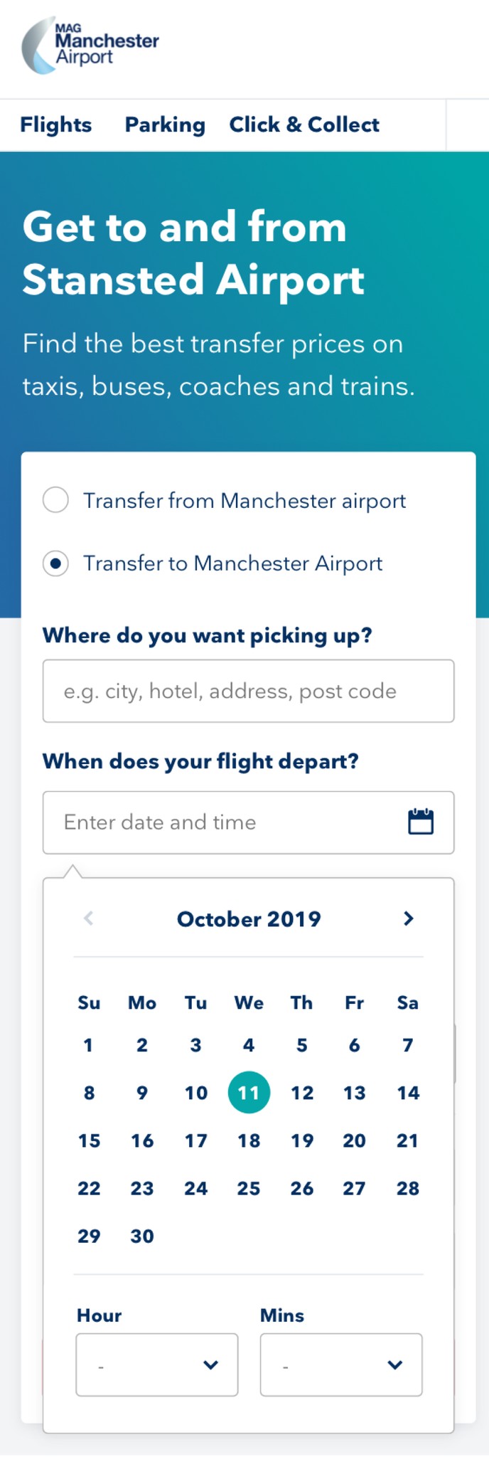
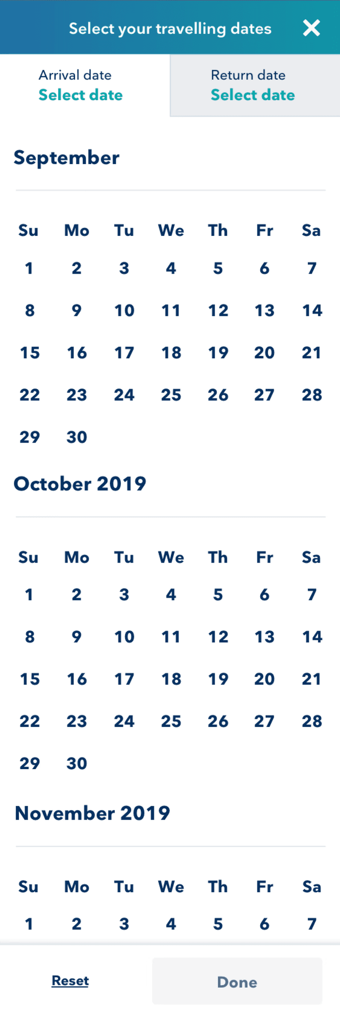
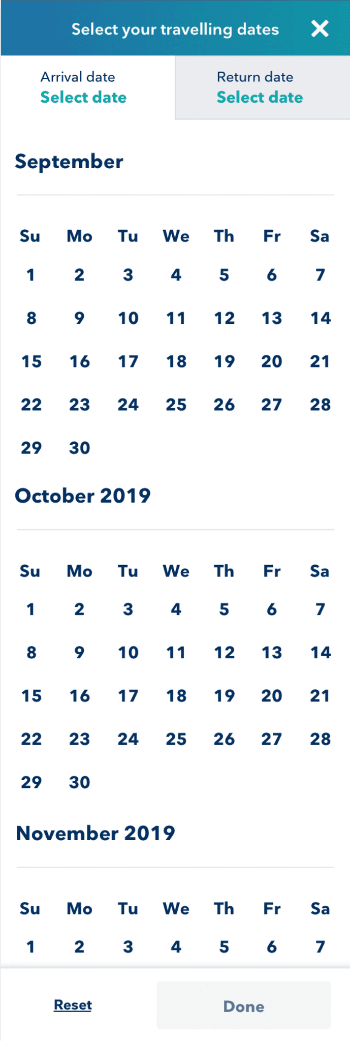
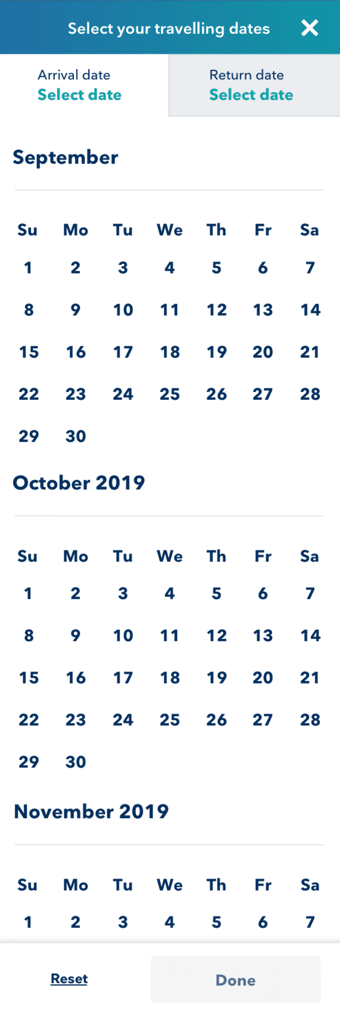
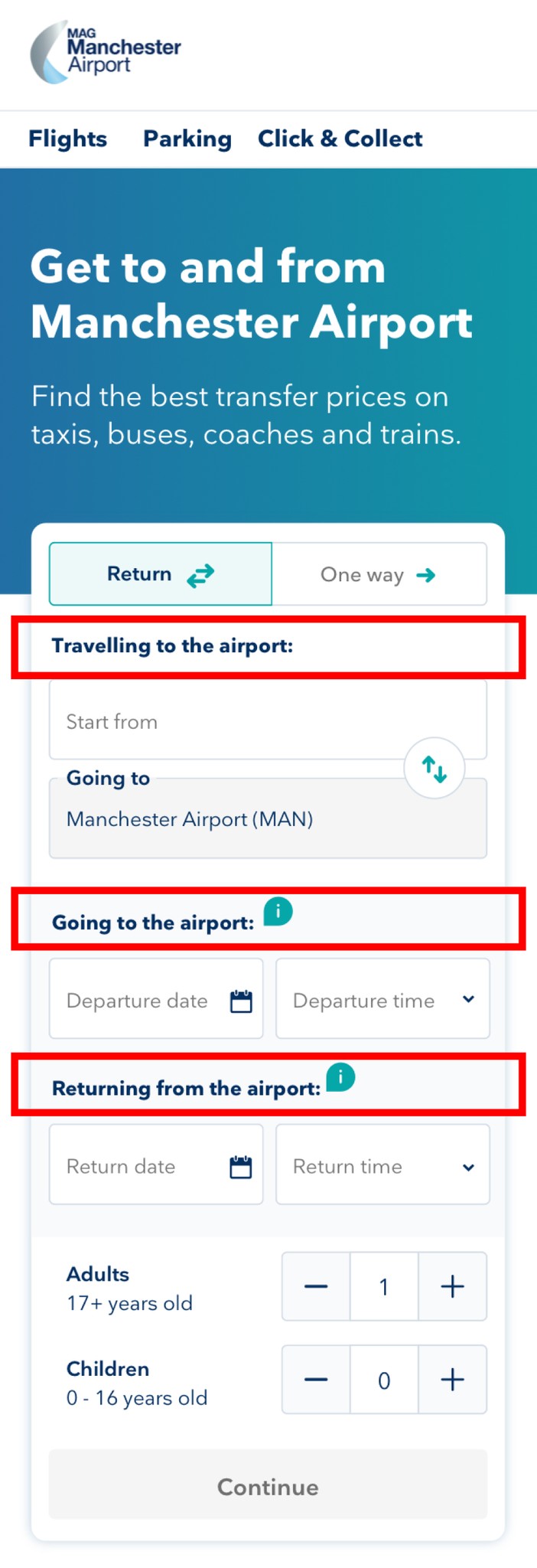
  • We separated the date and time picker, allowing users to focus on one task at a time for greater clarity.

  • The calendar was redesigned as a full-page overlay with “Done” and “Reset” buttons, a familiar pattern in the travel industry that promotes focus and usability.


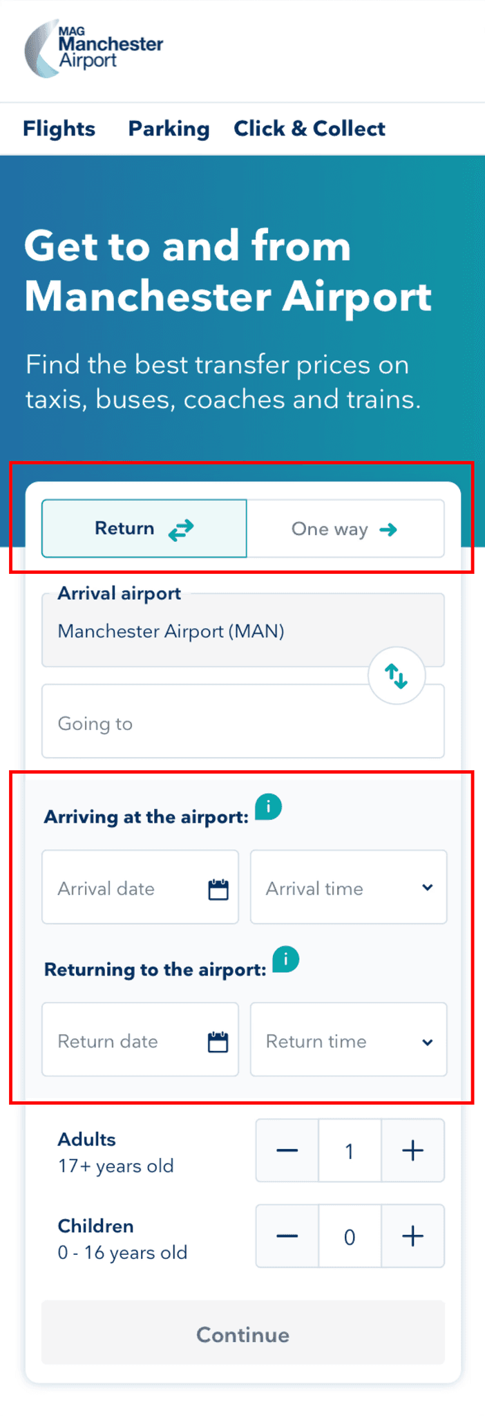
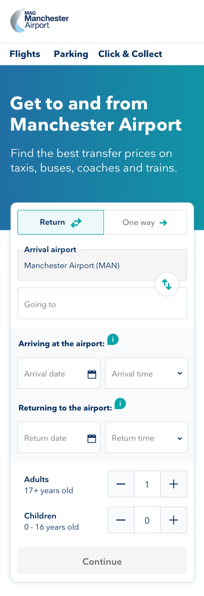
  • To address confusion around return journeys, we made the return toggle more prominent by placing it at the top of the search form, ensuring it was the first element users interacted with during their search.

These refinements aimed to simplify the search process and align the design with user expectations, creating a more intuitive experience.

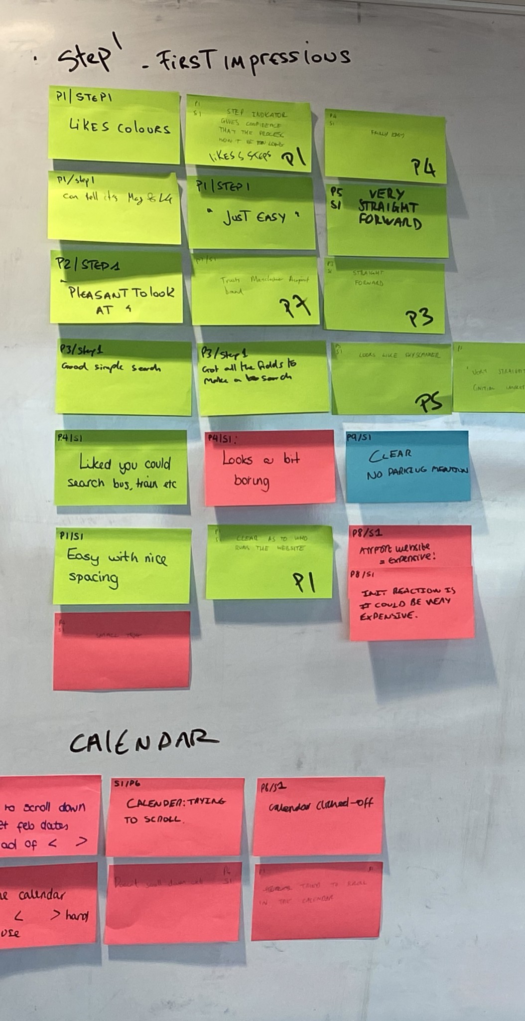
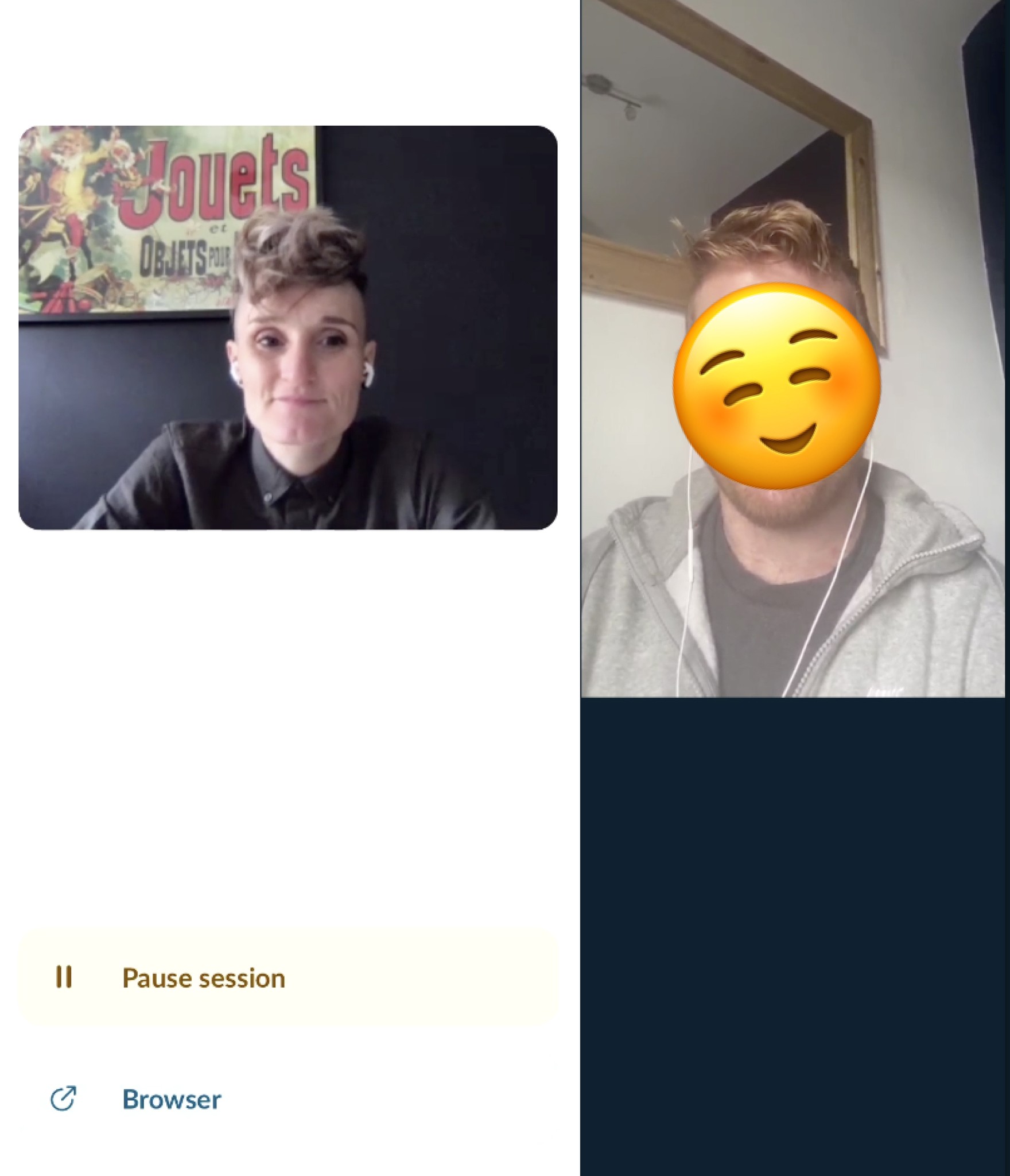
Validating Assumptions Through Guerrilla Testing

To validate our new design assumptions, we conducted guerrilla testing at the airport’s train and coach station.

While the updated prototype addressed some usability issues, participants still expressed confusion over the language used in the “arrival airport” and “going to” fields, with a few participants booking incorrect journeys as a result.

To resolve this, we collaborated with a UX writer to refine the language, amending the designs to ensure clarity and reduce booking errors.

Launched MVP Designs

Launched MVP Designs

Team Notes from Lab Testing Sessions

Team Notes from Lab Testing Sessions

Launched MVP Designs

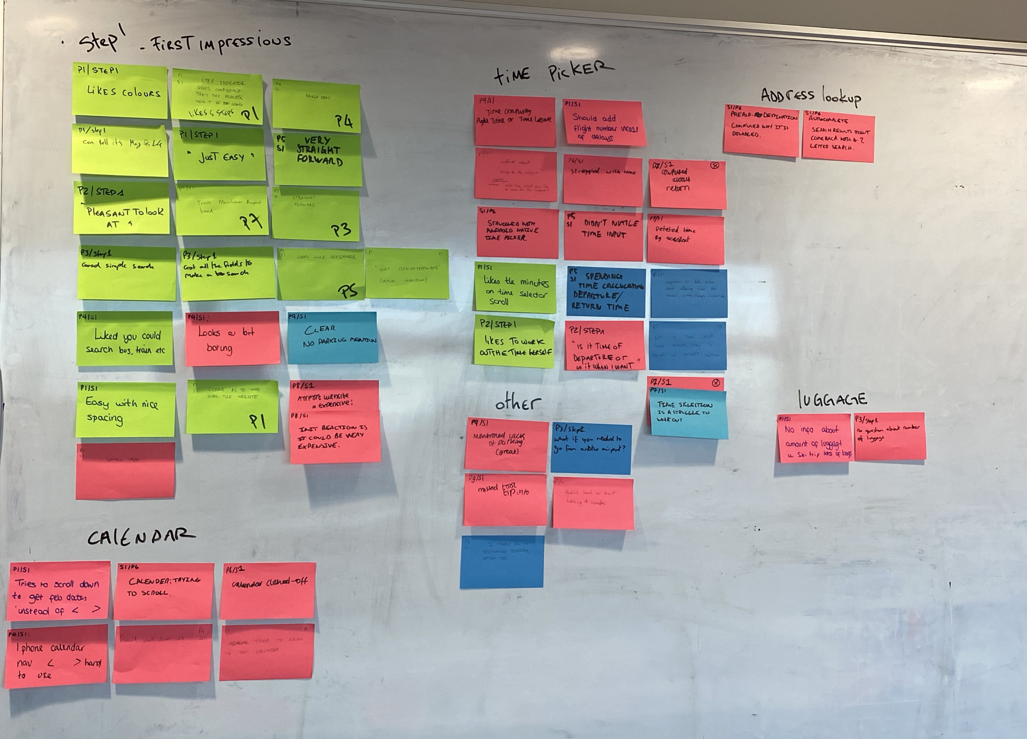
Testing the MVP to Define Next Steps

To determine the next priorities and iterations for the MVP, we adopted a data-driven approach. We analysed Hotjar recordings and Google Analytics data to uncover user behaviour patterns and identify pain points.

Additionally, we conducted usability testing in our lab to gain deeper insights into the user experience. This comprehensive mix of qualitative and quantitative data informed our roadmap for refining the product further. We adopted a data-driven approach to determine the next priorities and iterations for the MVP.

Team Notes from Lab Testing Sessions

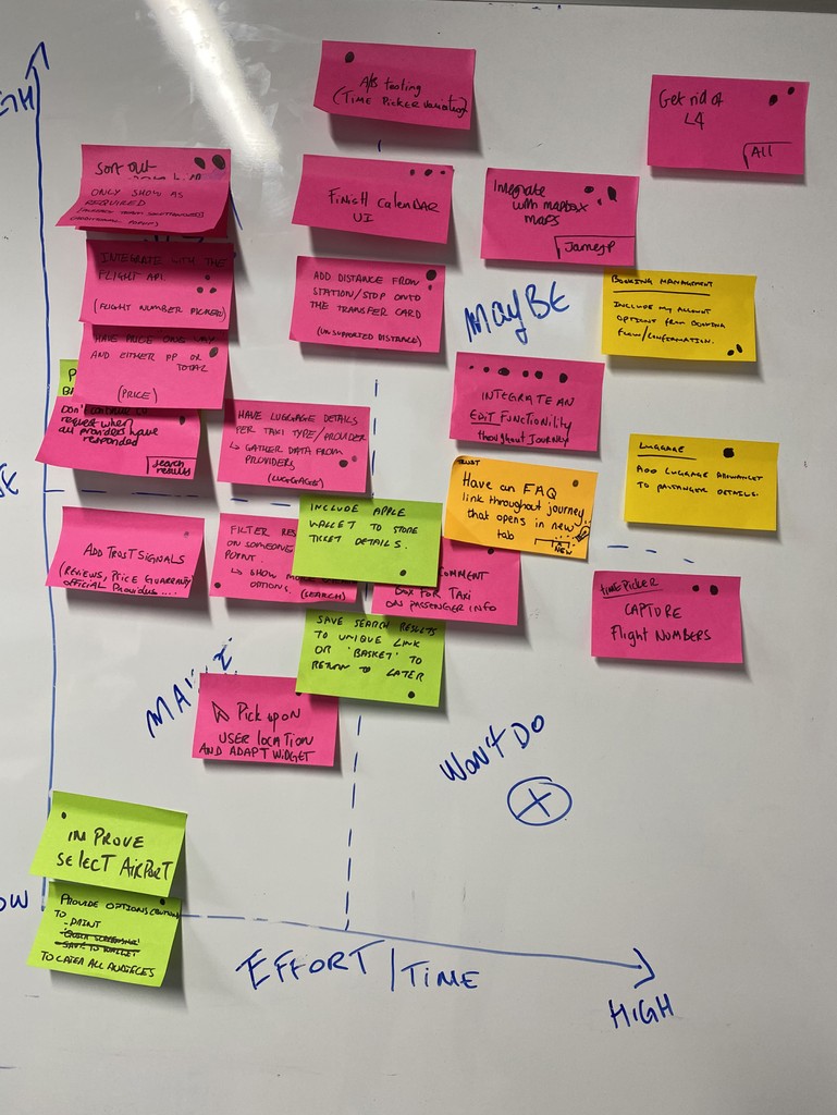
Building an A/B Testing Backlog

After completing user testing, we brought the entire product team together for playback workshops and ideation sessions.

To establish a robust A/B testing backlog, we followed a structured, collaborative process. After user testing, we conducted playback sessions where the team wrote “How Might We” (HMW) statements to reframe problems into opportunities. Each team member presented their HMWs, which were then grouped into themes.

Then, the team brainstormed ideas, dot-voted on the most promising ones, and prioritised them using a value vs. effort graph. This approach ensured that our backlog was focused on high-impact opportunities and aligned with both user needs and business goals.

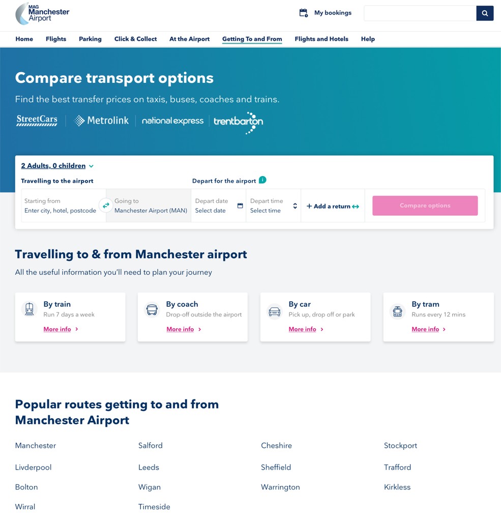
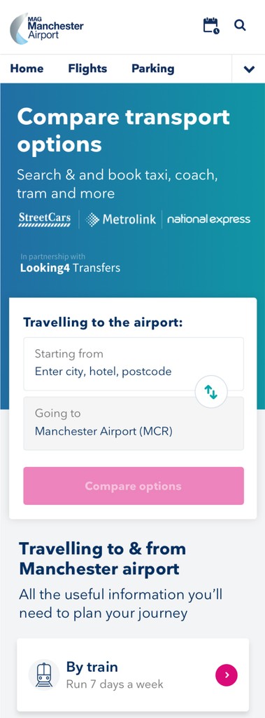
Final Home page widget

Get in touch

The results

We managed to run one A/B test on the transfer product before the COVID-19 lockdown, and it was a clear success.

However, as the pandemic unfolded, the company decided to redirect its focus towards its more established products, putting the transfer product work on hold. While the project was paused, the results of our test demonstrated the potential of the approach and provided valuable insights for future development.

Read more of my case studies

Get in touch