The brief
William Hill needed a full rethink of their betslip experience, the core touchpoint where users place and manage bets. The existing design wasn't keeping pace with competitor products or evolving user expectations.
Brought in on a 6-month contract, I led an initial discovery phase to understand pain points and opportunities, then moved into a full redesign of the betslip across the product.
I owned the end-to-end UX and design strategy, working closely with the product manager to define a phased approach and delivery roadmap that would land the full redesign within 6 months. I led stakeholder presentations, ran ideation and playback workshops, and drove alignment across the team throughout.
We started with moderated usability testing on the highest-traffic journeys, football and horse racing, to ground our decisions in real user behaviour. Those findings shaped a phased delivery plan, allowing us to tackle the biggest pain points first while building momentum for the wider redesign.
Discovery
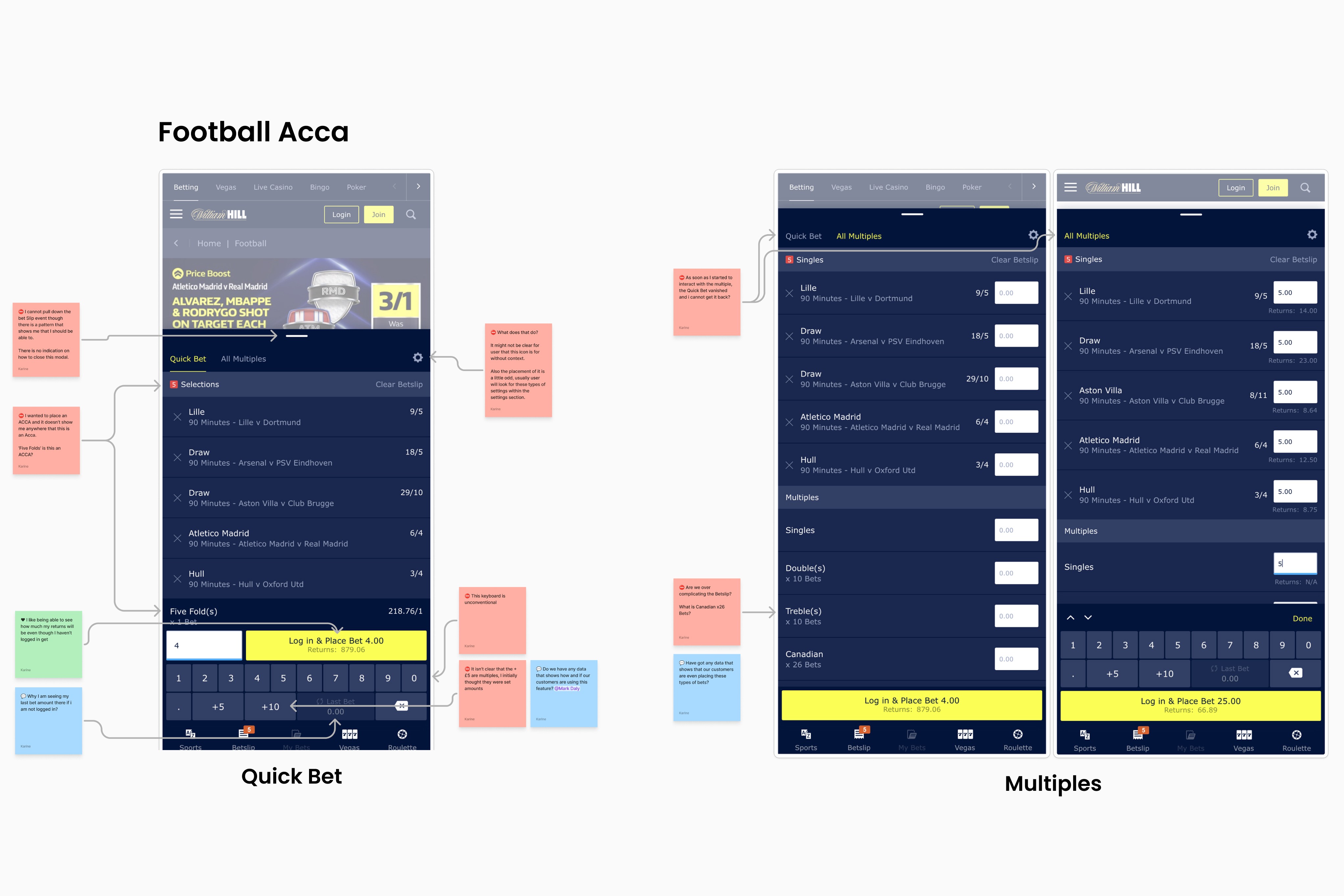
We started with a heuristic review of the existing betslip to surface assumptions and identify usability gaps.
These findings shaped a moderated usability test focused on the most common journeys: placing a single bet and building an accumulator. Testing with real users gave us a clear baseline of where the experience was falling short and what needed to change first.
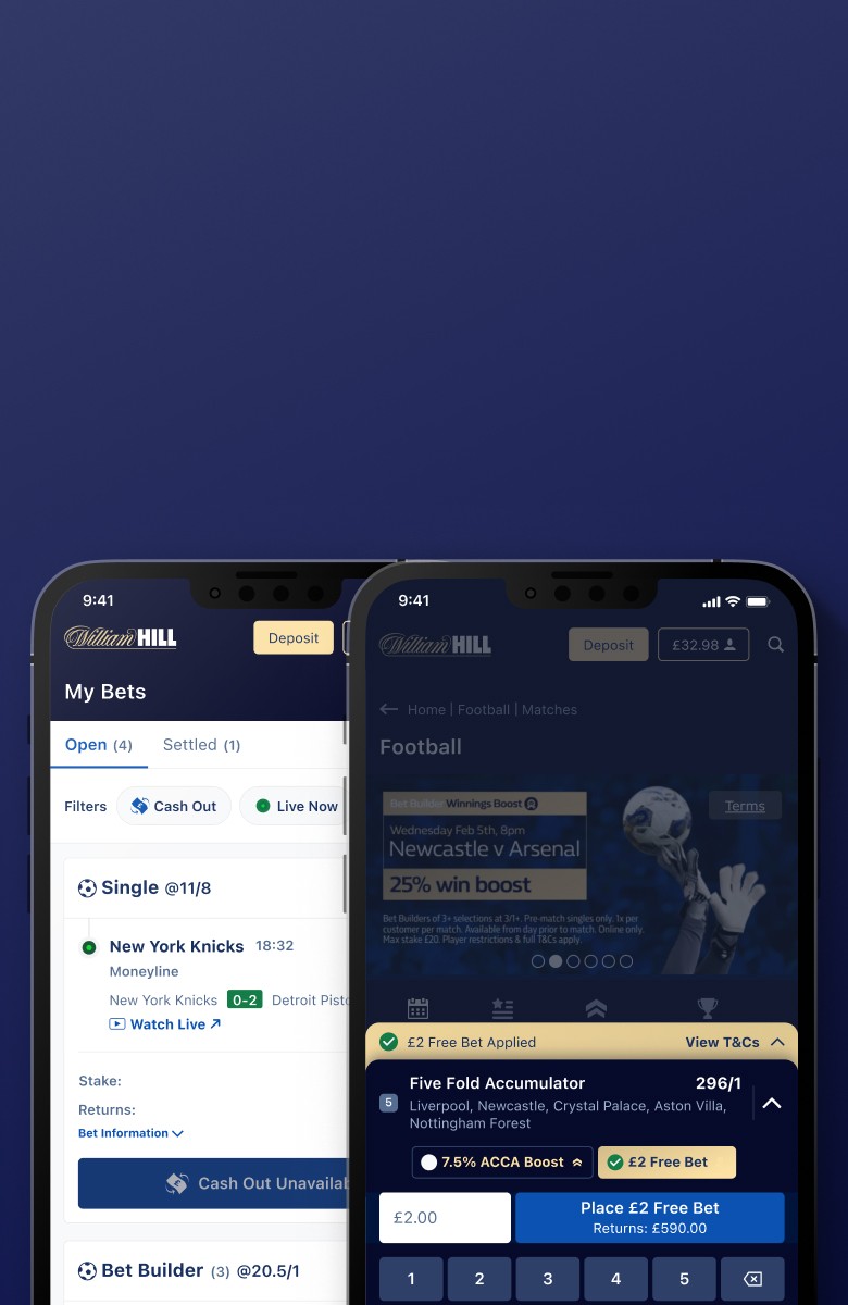
Phase 1: Core Betslip & My Bets
We tested concepts iteratively against our baseline to measure improvement.
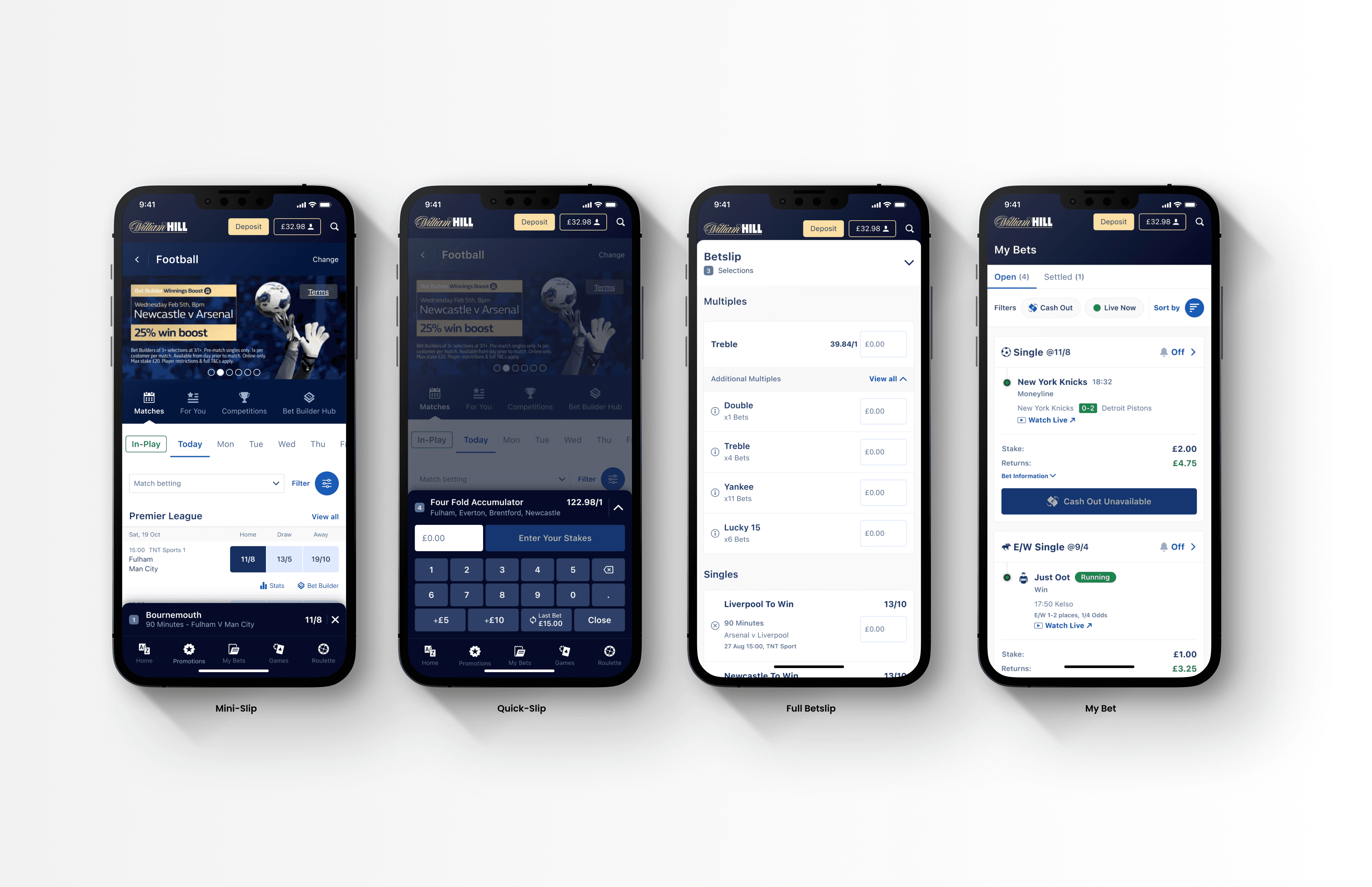
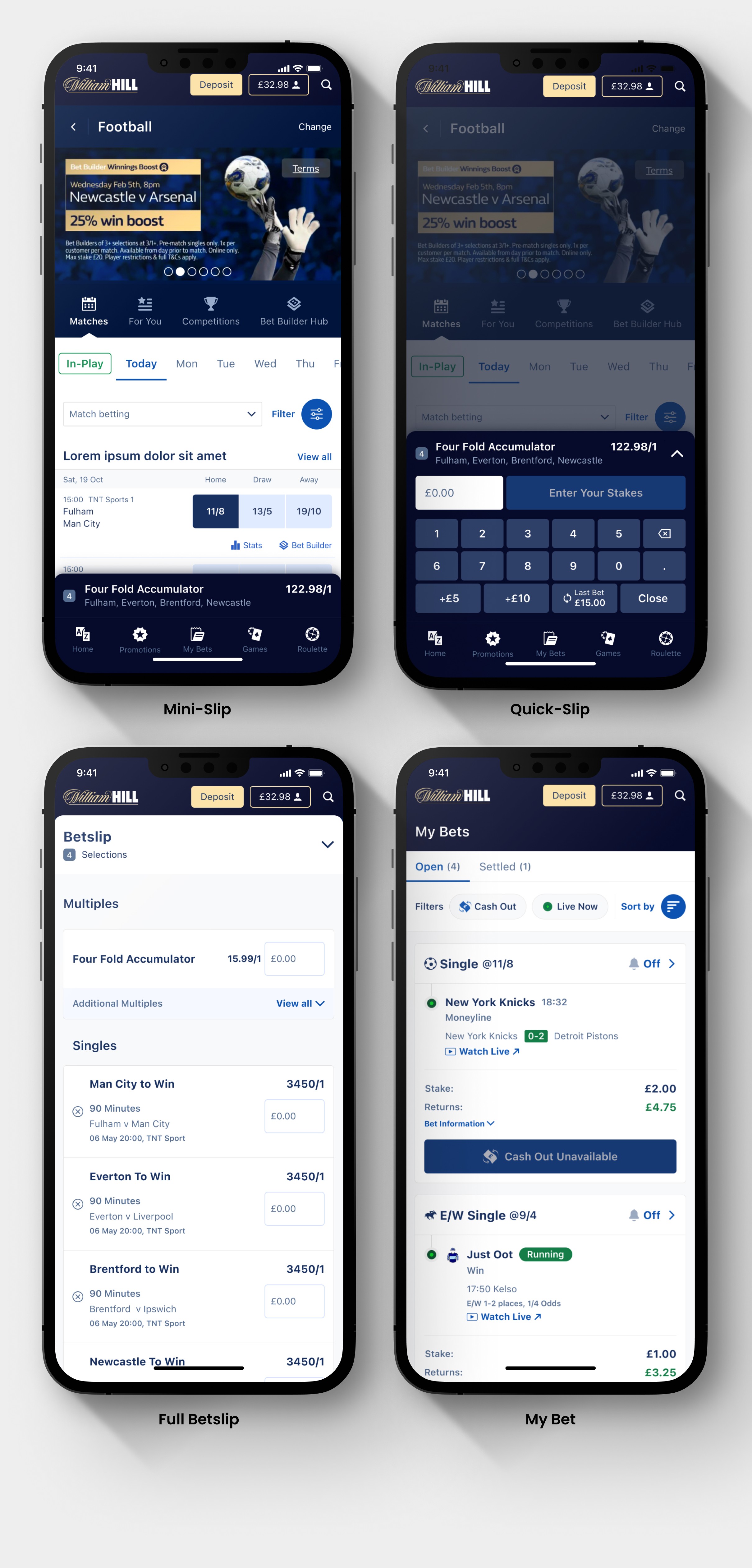
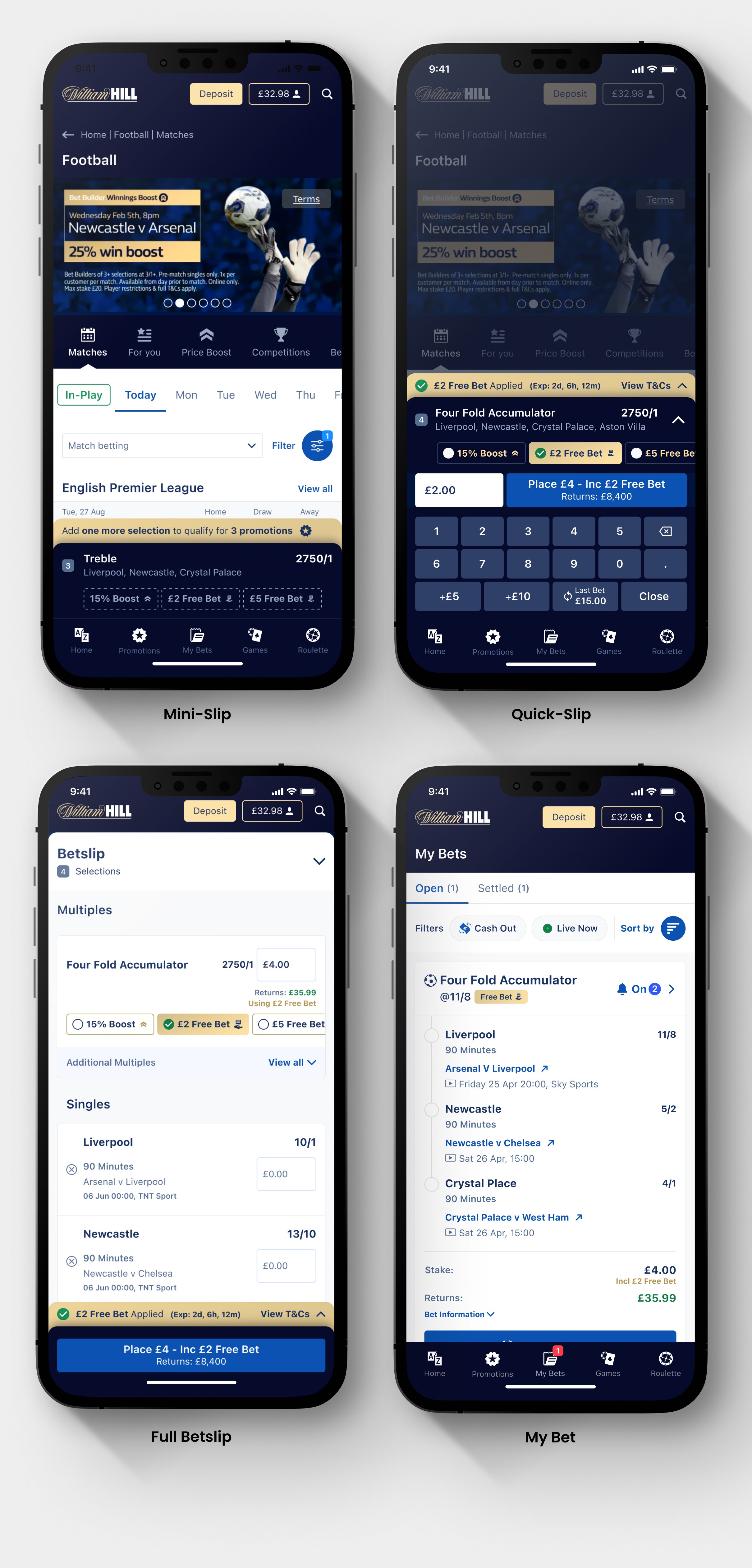
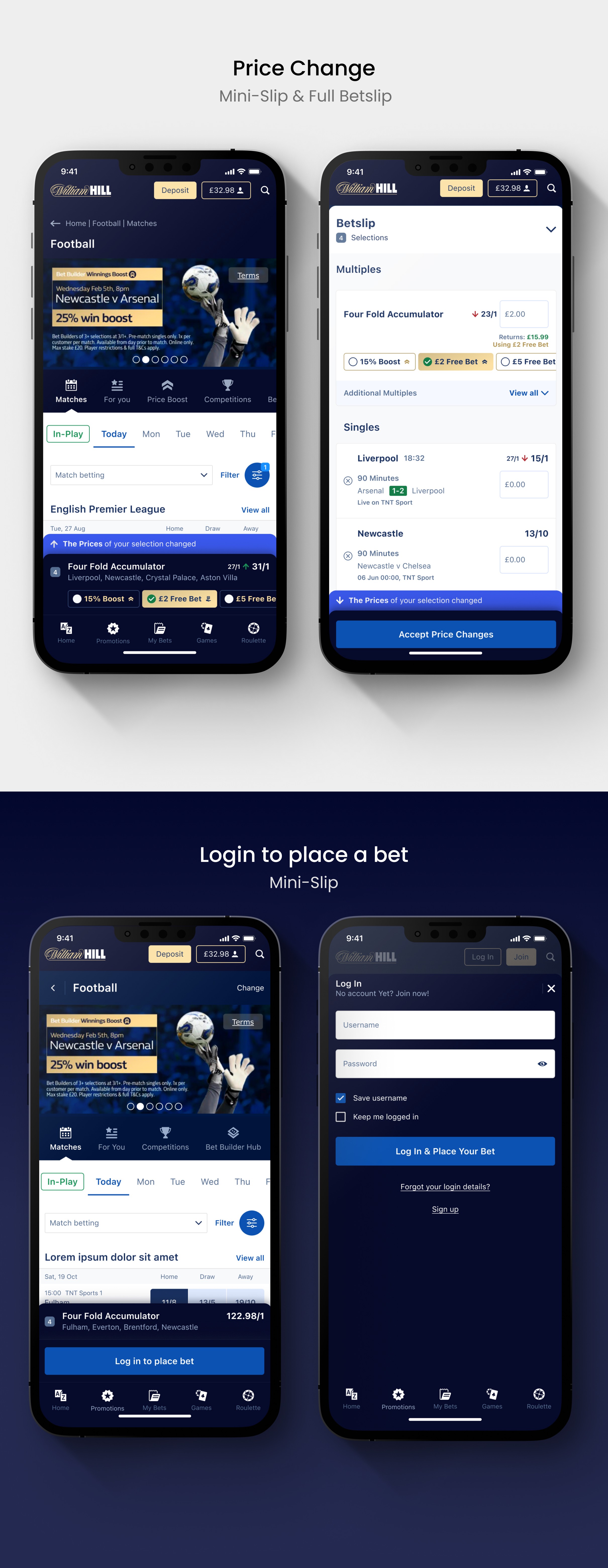
A key design decision was a new compact mini-slip that doesn't block browsing. We tested the gestures for opening and closing it extensively to get the interaction right.
On the full betslip, we simplified multiples into a dropdown with info buttons after users told us they didn't understand what those options were.
On My Bets, we fixed bets incorrectly showing as lost during live matches, added real-time status updates, and introduced subtle animations to make the in-play experience clearer.
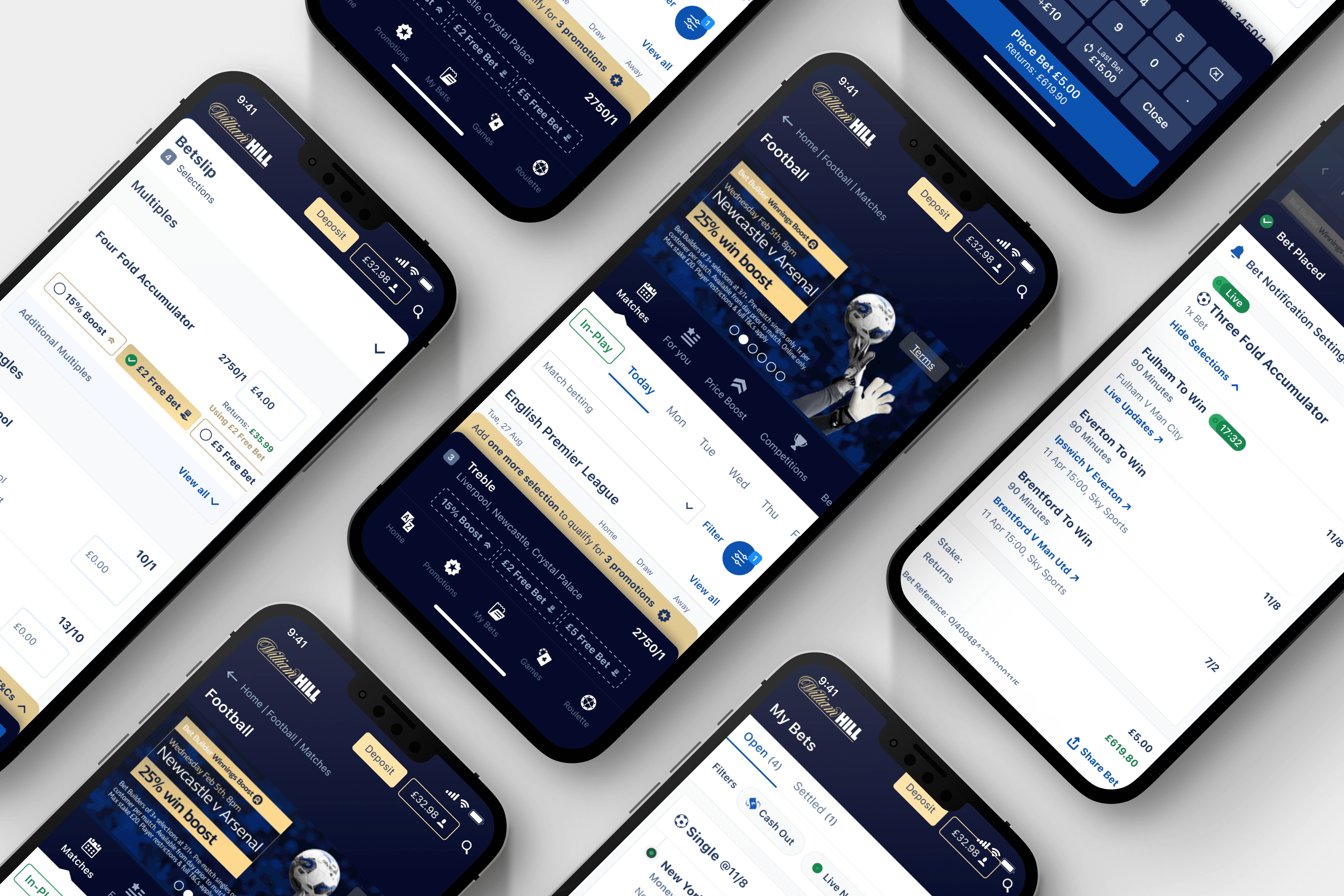
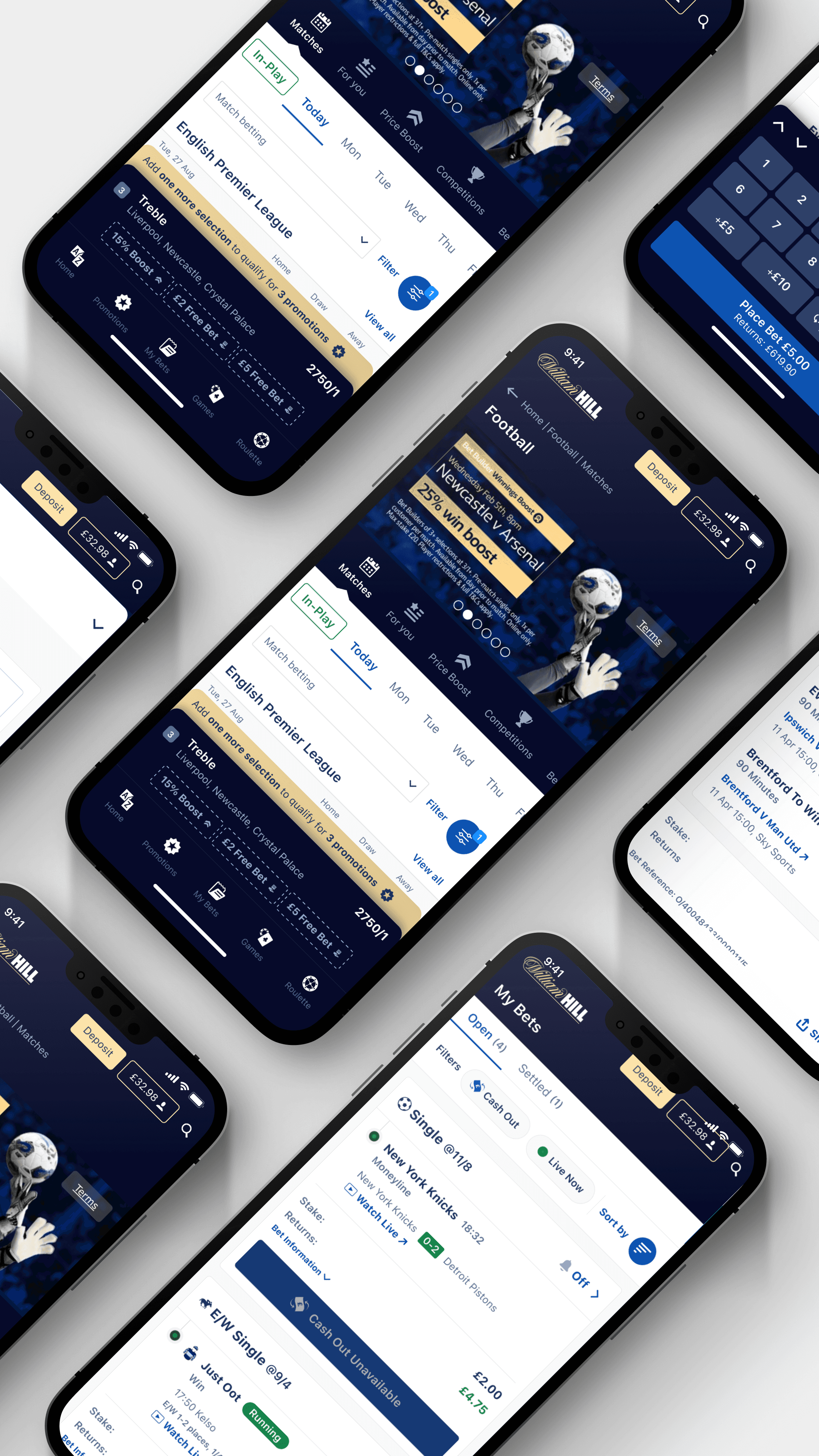
Phase 2: Promotions
We followed the same discovery cycle: moderated usability testing, concept exploration, iterative testing, and validation. The core challenge was making promotions easy to apply without cluttering the betslip.
We landed on a new concept, an additional tray that pops up as a dedicated promo hub. From there, users can see what they've applied, open the T&Cs, and select which promotion to add when multiple are available. This gave promotions their own clear space rather than cramming them into an already dense interface.

Validating the approach every steps of the way
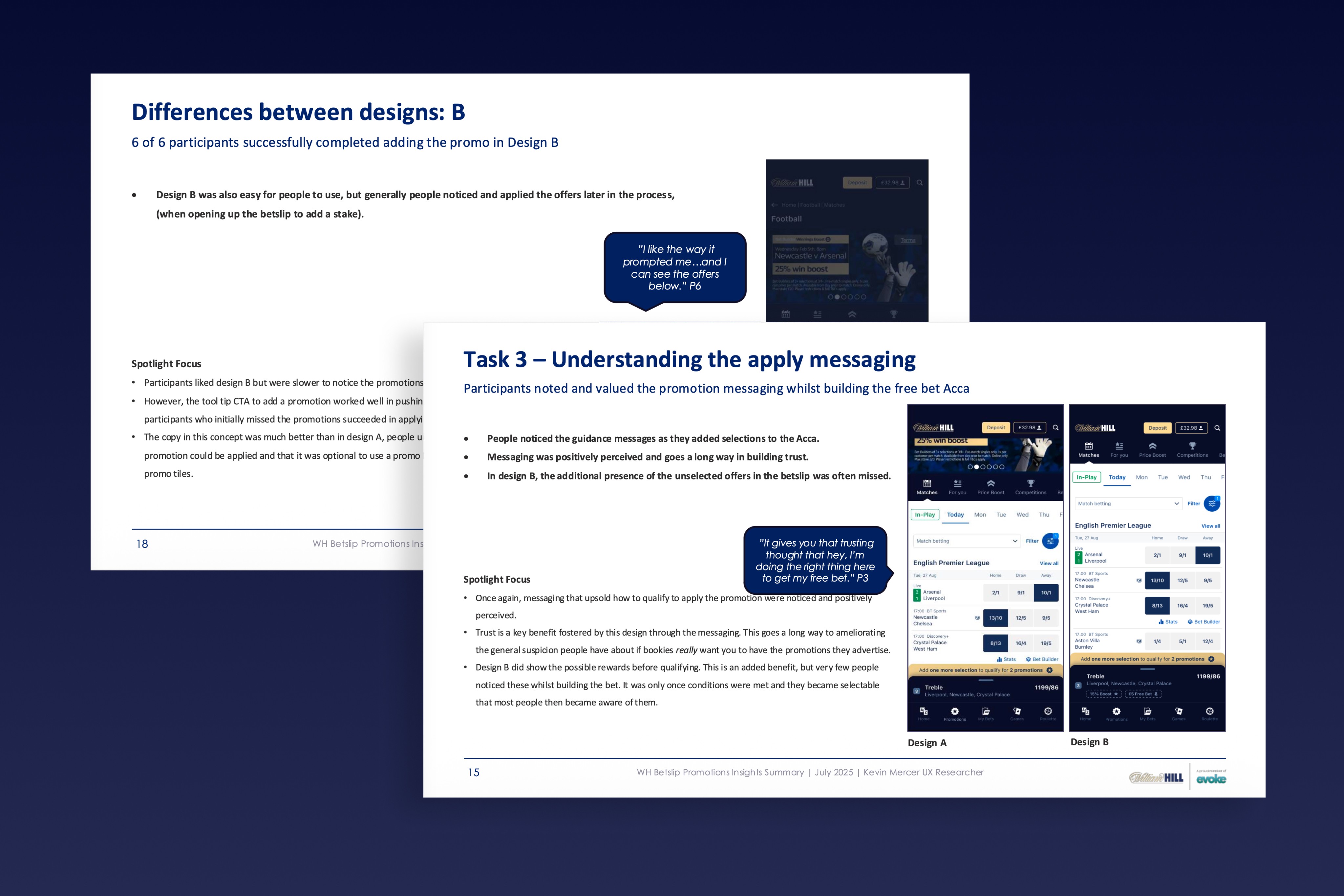
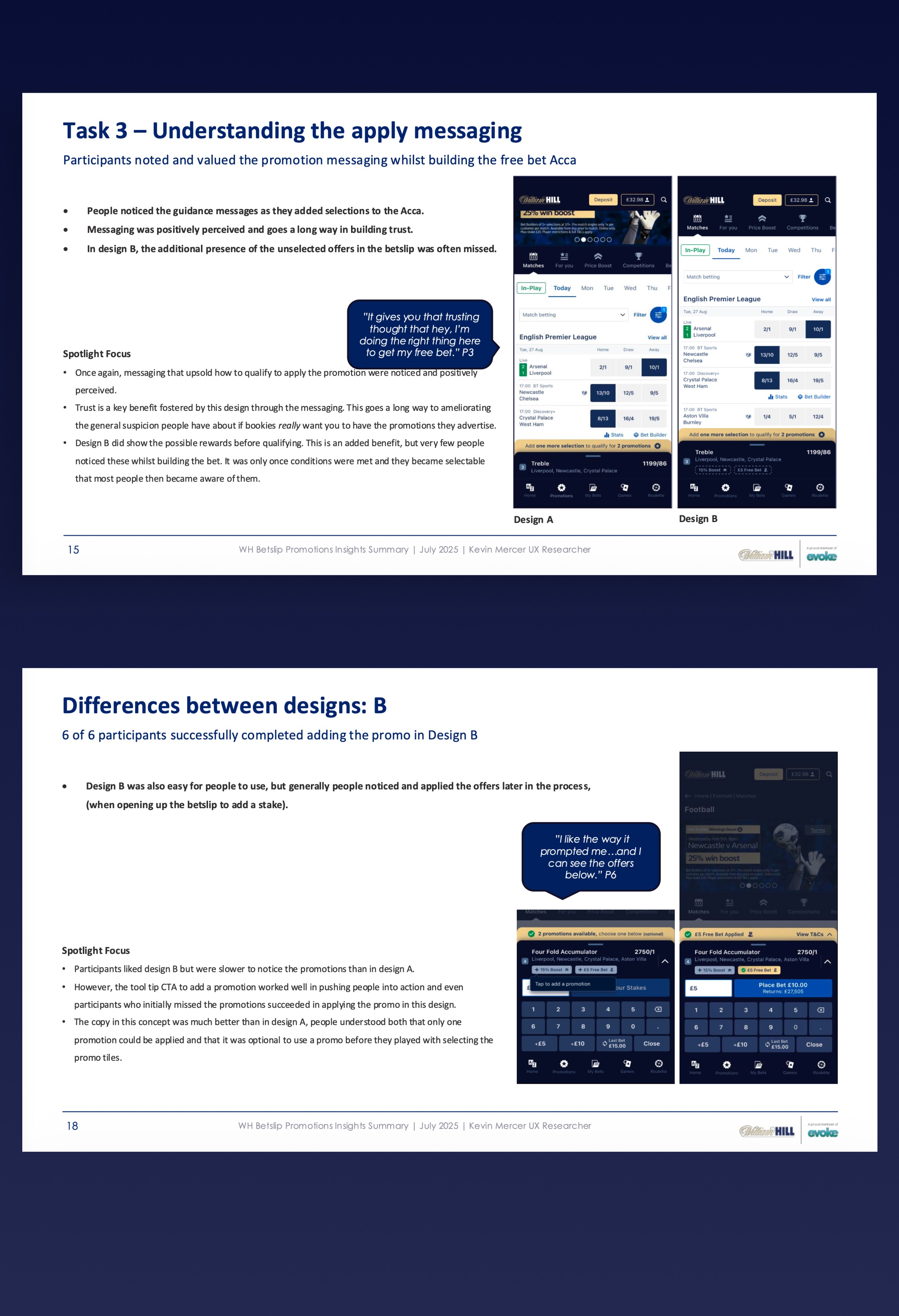
We tested two design directions for how promotions surface while users build their bets.
Both performed well, but the messaging that guided users on how to qualify was a standout, building trust and reducing the suspicion users typically have around bookmaker promotions.
These findings directly shaped the final design.
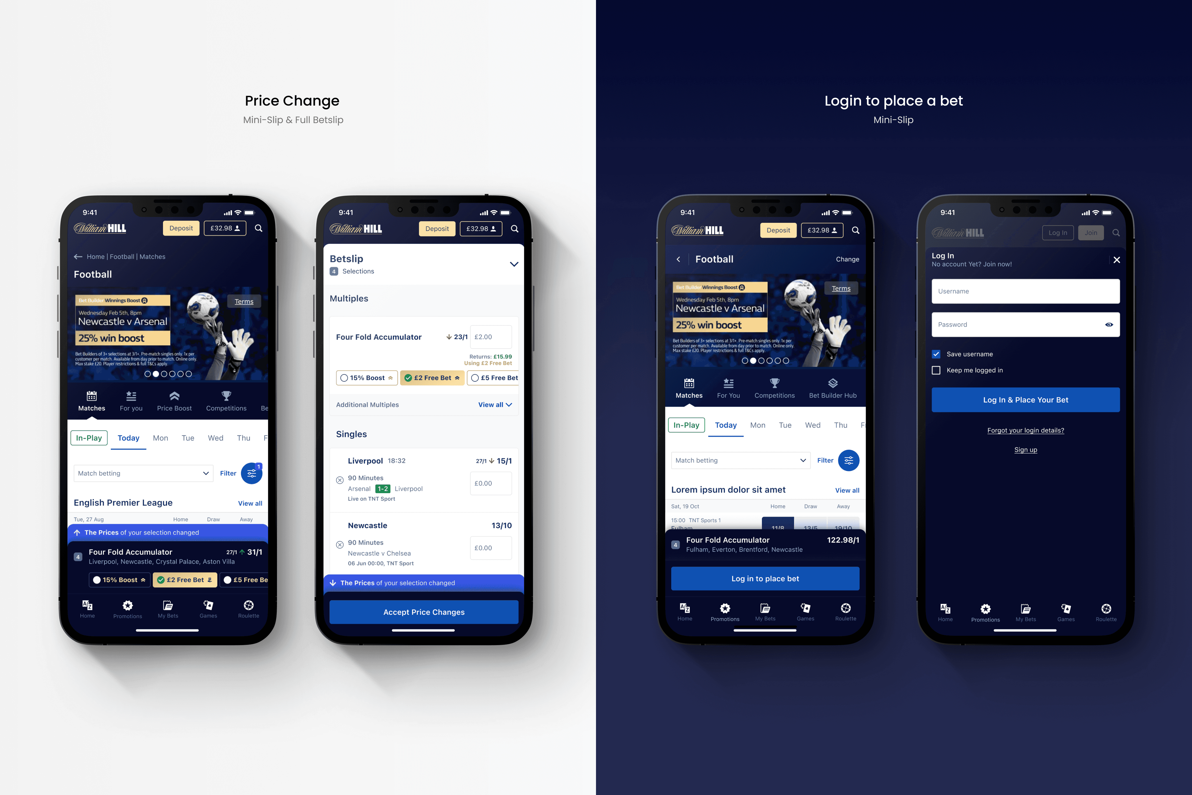
Phase 3: Error Handling & Friction Reduction
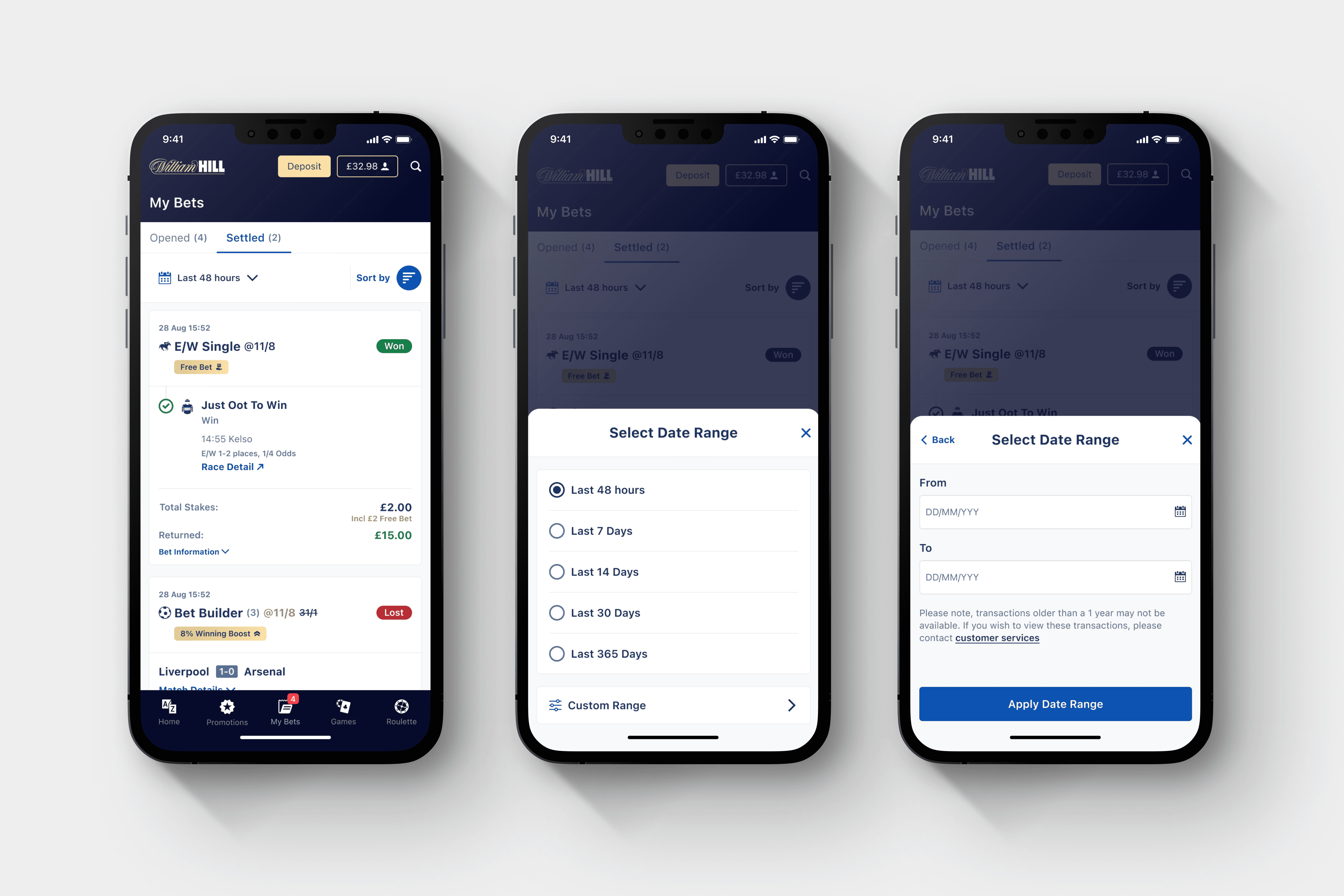
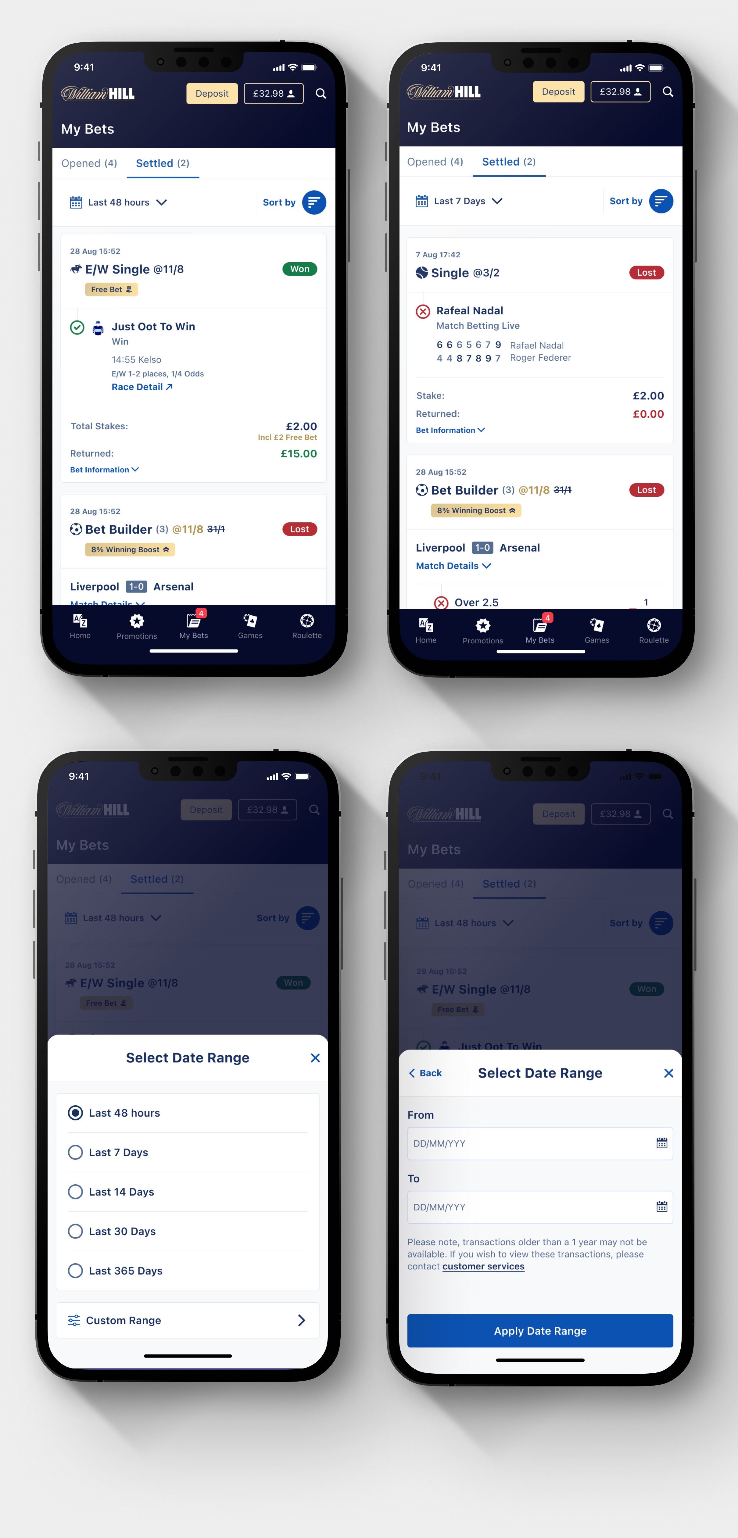
Phase 4: Settled Bets & Notifications
The final phase tackled the post-bet experience. Using the same discovery and testing cycle, we redesigned how settled bets are presented and how notifications keep users informed, closing the loop on the full betslip journey from placement through to outcome.